DESIGN EDIT ISSUE 36 | DESIGN TOUR
When these clients brought their beachfront home it came with sublime views, but a kitchen that definitely needed an update. The blue-tiled benchtop may have featured on the cover of Trends magazine back in the 1990s, but when a major renovation was undertaken to update and reconfigure the home the kitchen received attention first!
THE BRIEF
The owners couldn’t wait to update the home as soon as they had purchased it and asked Kirsten Ford Design to partner with them through the renovation process. One of Kirsten’s first tasks was to create a concept for a new kitchen to transform the open plan space, embracing its beachside location.
COLLABORATORS
Kirsten introduced her clients to Krys from Bella Kitchens to bring the initial concept to life. Having worked with Bella previously, we knew they would be able to create a very special and beautiful kitchen and that also scored high on functionality. Bella also offer a complete design to install service for logistical ease and work in close partnership to bring to life the vision we set with the style concept.
INSPIRATION
We did not want to create a themed, cliche look for this kitchen. Instead we wanted to re-interpret the classic beachside style with a bold dash of stye and edge. We also wanted to treat the main pieces of cabinetry as furniture, blending the kitchen seamlessly from a functional area to the living space beyond, creating a connected, considered and sophisticated feel through the space.
“We wanted to re-interpret classic beach-side style - with a bold dash of style and edge.”
DESIGN DETAILS
A restrained but detailed material palette elevates the style points and ensures timelessness for this kitchen. The selections include a stunning statement stone, brushed bronze accents, reeded glass and timber-look laminate for the cabinetry.
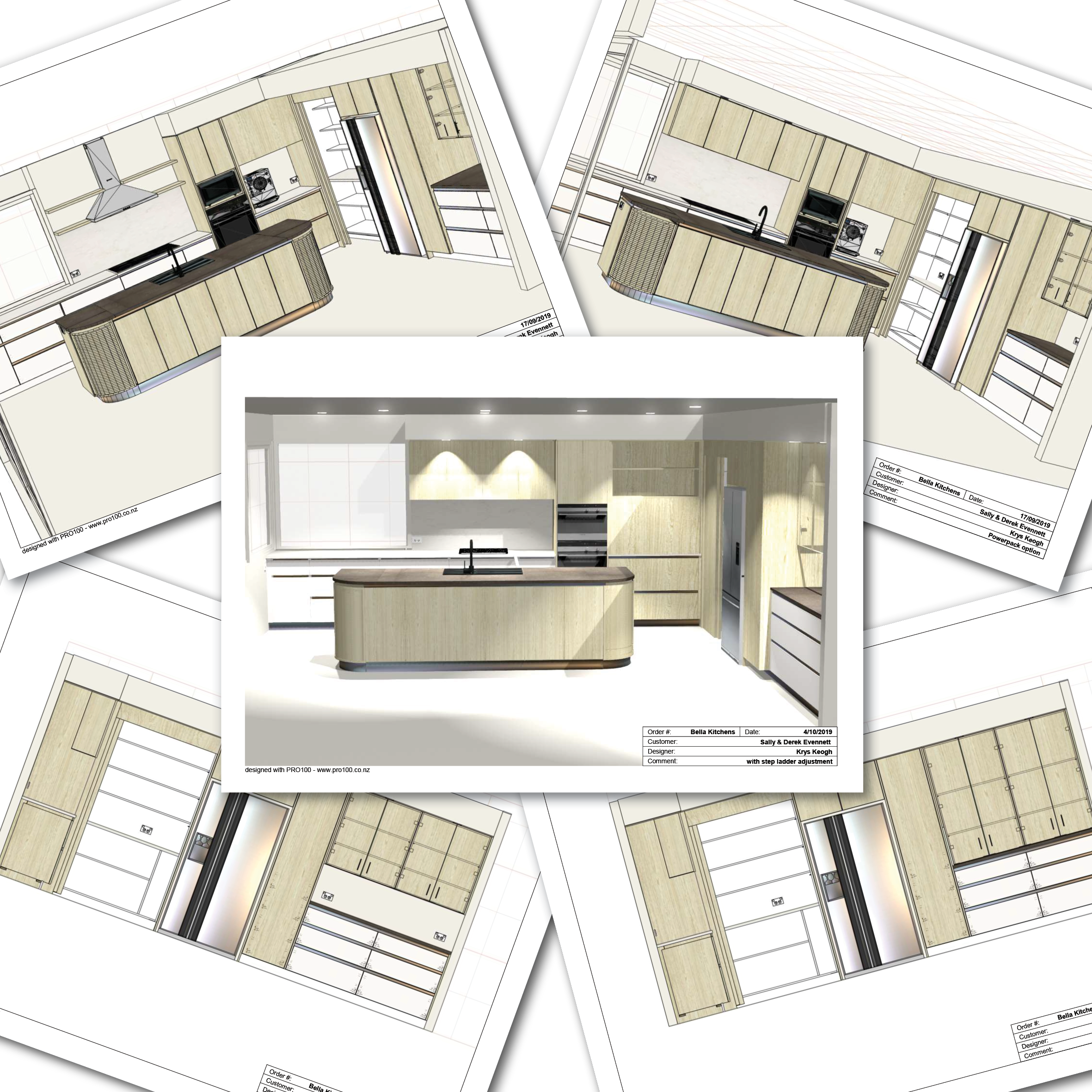
Taking pride of place is the free-standing island bench, positioned to soak up the expansive view of the sea. The bold curved form accentuates the organic style cues, in a melamine reminiscent of bleached driftwood. And the stone benchtop is the absolute hero. The vivid sand-like patterns on the three-metre slab of Brazilian quartzite is like a piece of natural art.
Practically the island, reconfigured from the previous U-shaped kitchen, creates a second entry point, allowing ease of movement through the space and connection to the outdoors and beach beyond.
There’s now plenty of storage for appliances, cookbooks and dinnerware, display shelving for the client’s collectables, a pantry and a super-clever workstation for tea and coffee with a vertical sliding door.
Kirsten worked with her network of suppliers to import from Italy super-large format tiles, thin enough to tile over the top of the existing tiles.
INSIDE EDGE
The reeded glass overhead cabinetry adds a lightness to the space while still being opaque enough to obscure the items inside - also providing ample storage for glassware. Throughout the kitchen brush bronze accents, including the negative detail handles in a hardwearing laminate, gleam with subtle metallic glamour.
THE RESULT
The finished space boldly embraces a new era for the home, perfectly marrying form with function, with the bold curving island and sandy materials palette updating the space with refined, timeless luxury. It informs the rest of the home’s renovation and creates a sculptural centre point to the open plan space. By treating the cabinetry as pieces of furniture, the space feels connected, considered and sophisticated - a unique and contemporary take on beachside style.
See the entire project gallery here.
Contact Auckland Interior Designer Kirsten Ford for more information.
Images: Hanson & Daughters Photography
To read more of our recent blogs, click here.


