DESIGN EDIT ISSUE 54 | DESIGN TOUR
Our clients brought this home for it’s incredible views and beach side location with a vision to modernise the home for a new era. The first area for attention was the kitchen, where the style, design and colour palette would be continued throughout the home.
THE BRIEF
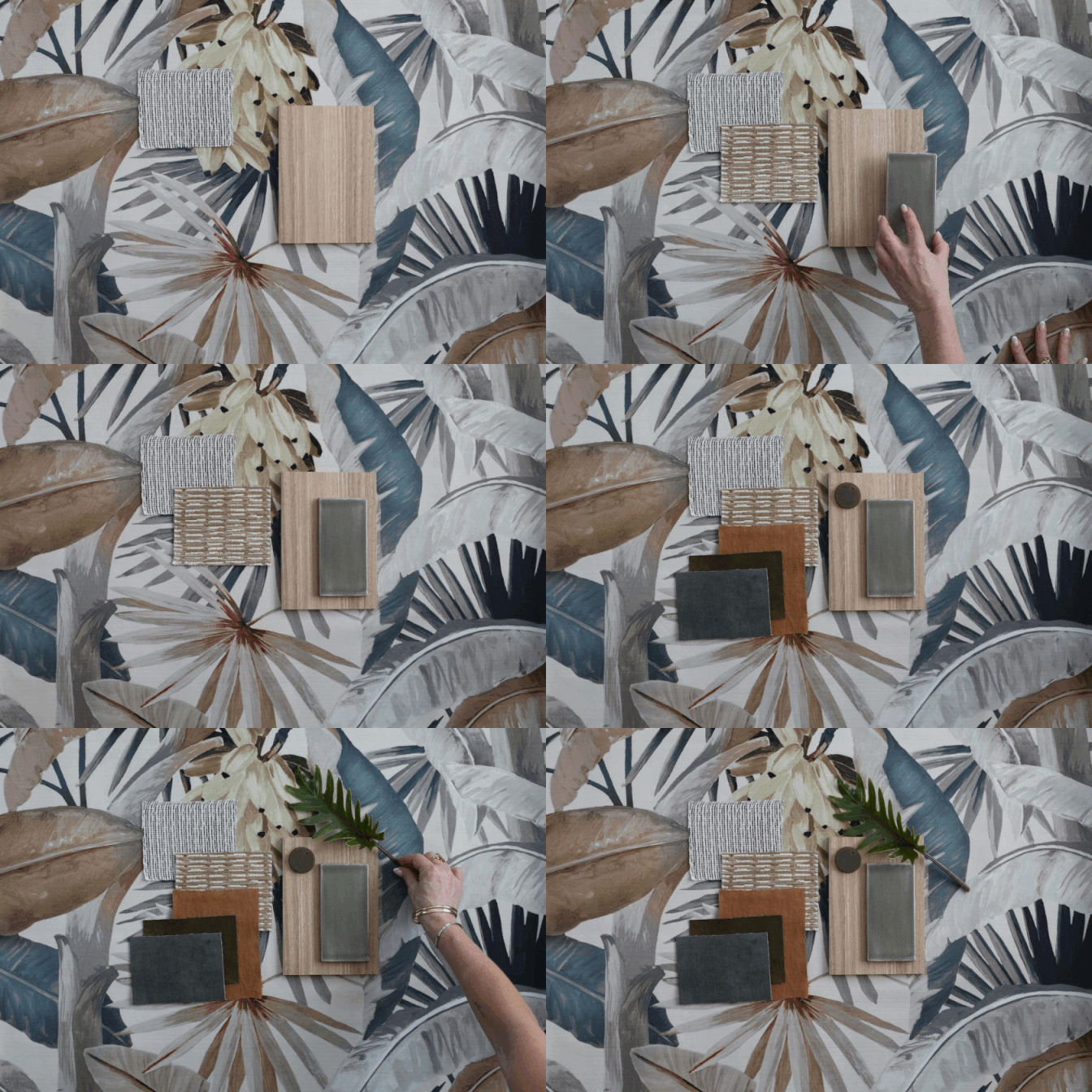
Soon after purchasing the home, the owners asked KFD Interiors to partner with them through the renovation process. One of Kirsten’s first tasks was to create an overall style concept for the home, to create a clear vision of the approach and design direction, including the colour palette, overall aesthetic and reference images.
INSPIRATION
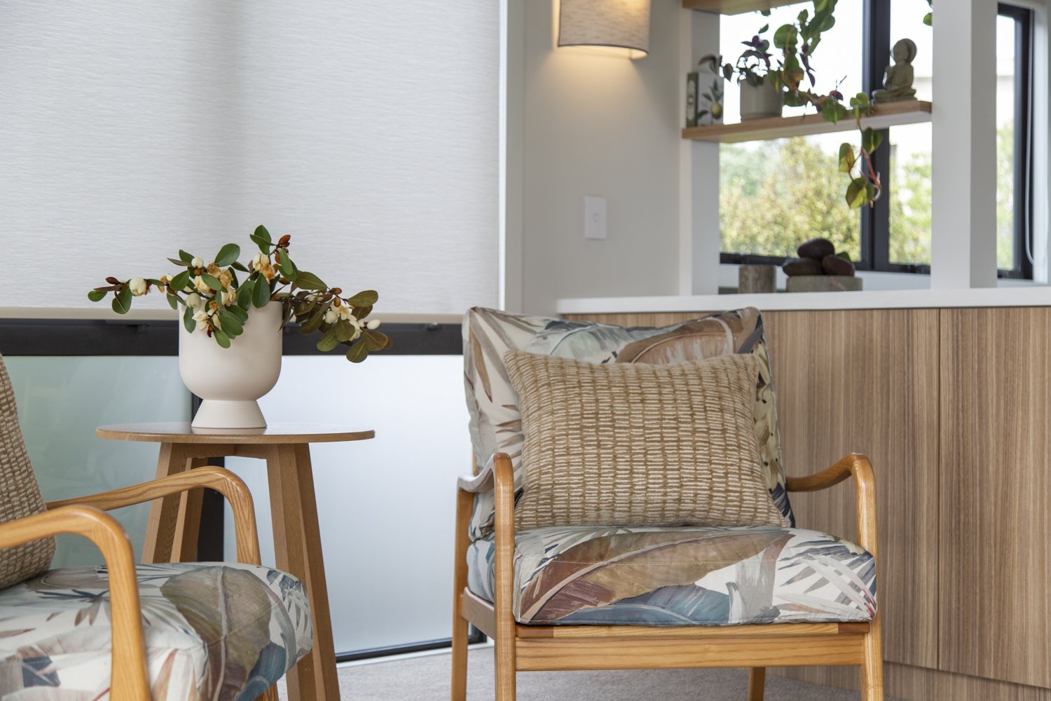
Design inspiration for a home always has a starting point, and for this renovation, the views of the the mature trees, the sea and surrounding cliffs inspired the colour and finishes selection. Muted leaf green, sandy taupe and baked clay tones are layered with contrasting textures throughout the finishes palette.
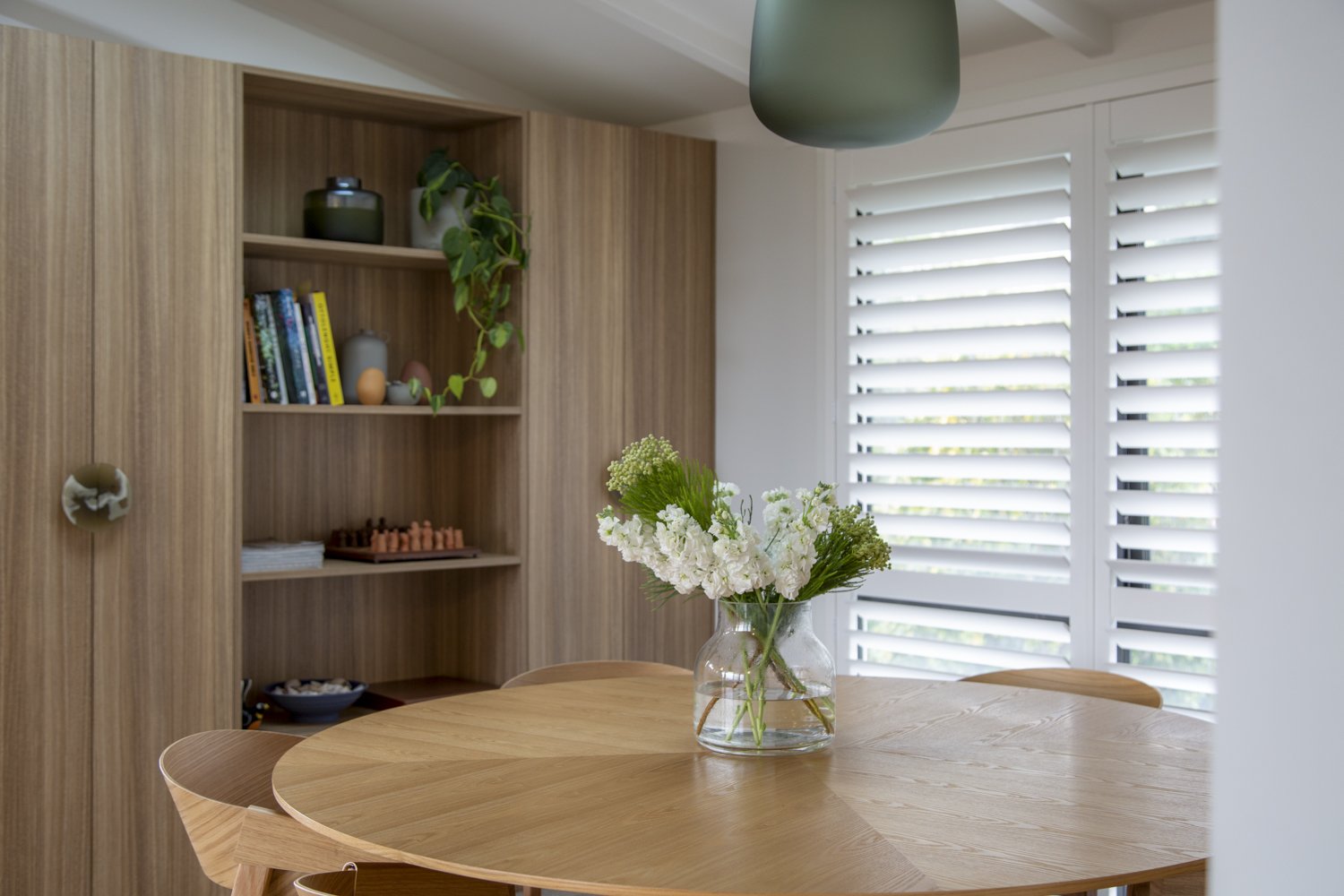
We also wanted to treat the main pieces of cabinetry as furniture, blending the kitchen seamlessly from a functional area to the living space beyond, creating a connected, considered and seamless feel through the space.
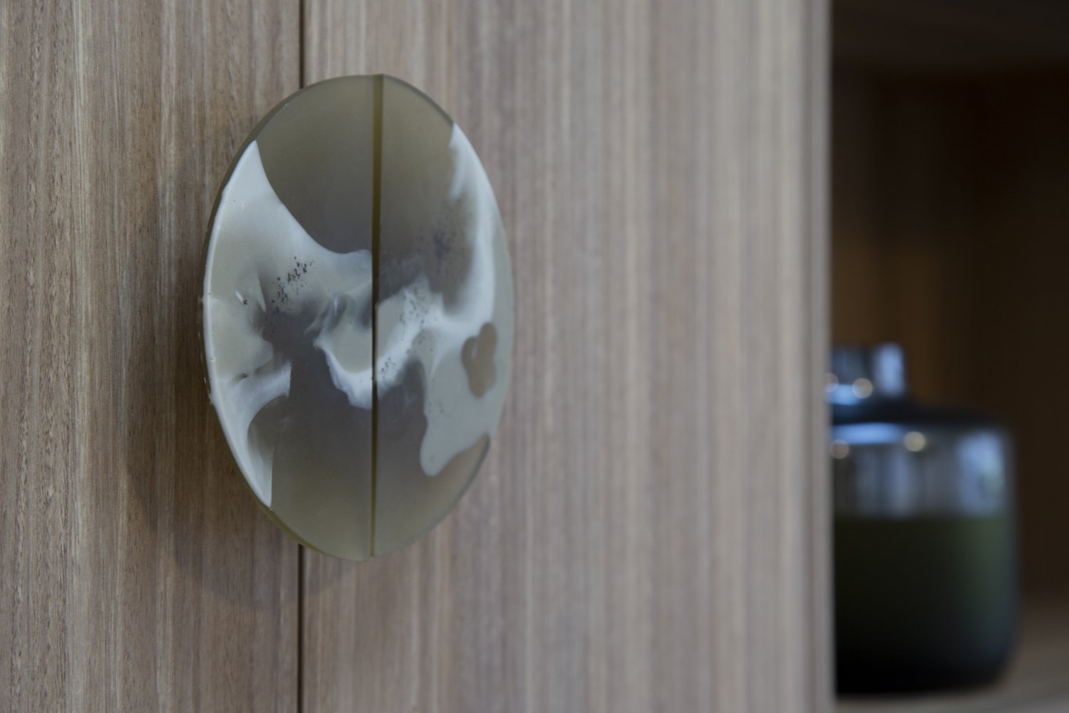
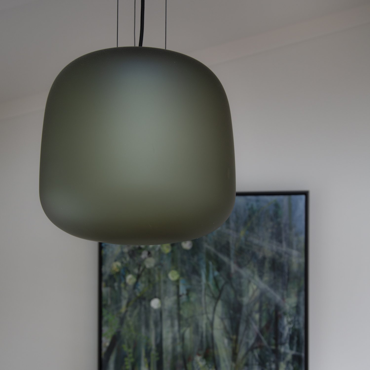
“This colour palette is both contemporary and timeless - and one that immediately makes the space feel restful, connected to nature. We’ve applied the tones to layers of finishes through the home, from textured paints, glass pendants, hand made tiles and custom resin door pulls.”
COLLABORATORS
The style concept informed the vision to transform the kitchen and dining areas into an open plan space, which honoured the original era of the home, yet fully updating the home for contemporary living.
Kirsten created an overall concept and materials palette for the kitchen, which was expertly brought to life by the team at Bella Kitchens.
DESIGN DETAILS
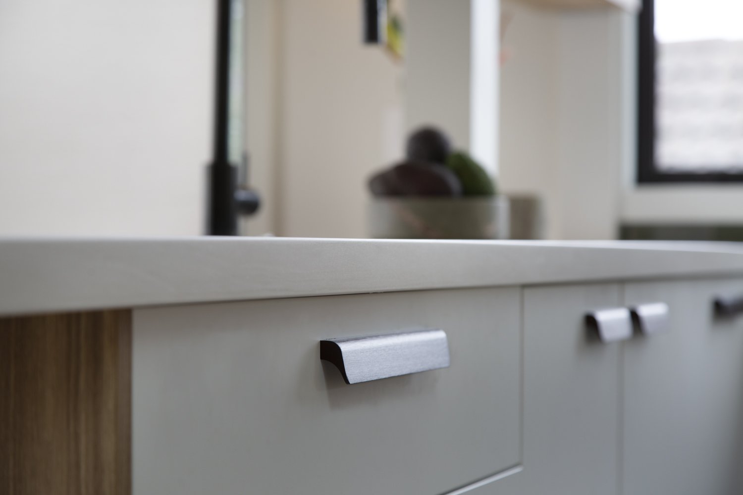
Nature inspired colours, shapes and textures have been applied to layers of finishes through the home - all of which are matt, burnished and brushed to mimic the views beyond the windows. The handmade kitchen splashback tiles were a non negotiable from the moment we presented them to the client! Warm, textured timber-look cabinetry links the kitchen to the open plan living spaces, the green echoed in matt glass pendant lighting, textured paint finishes and woven fabrics. But perhaps our favourite design detail is the hand made resin pulls - as Sally, their maker, says “art in function”. The perfect finishing touch!
INSIDE EDGE
Having a clear, shared style vision to guide this renovation provided a practical reference point of the myriad of decisions to be made over many months. It informs each area of the renovation, so selections from front door colour to curtain fabrics to bench top finish are all cohesive, creating a considered and harmonious feel to the home.
THE RESULT
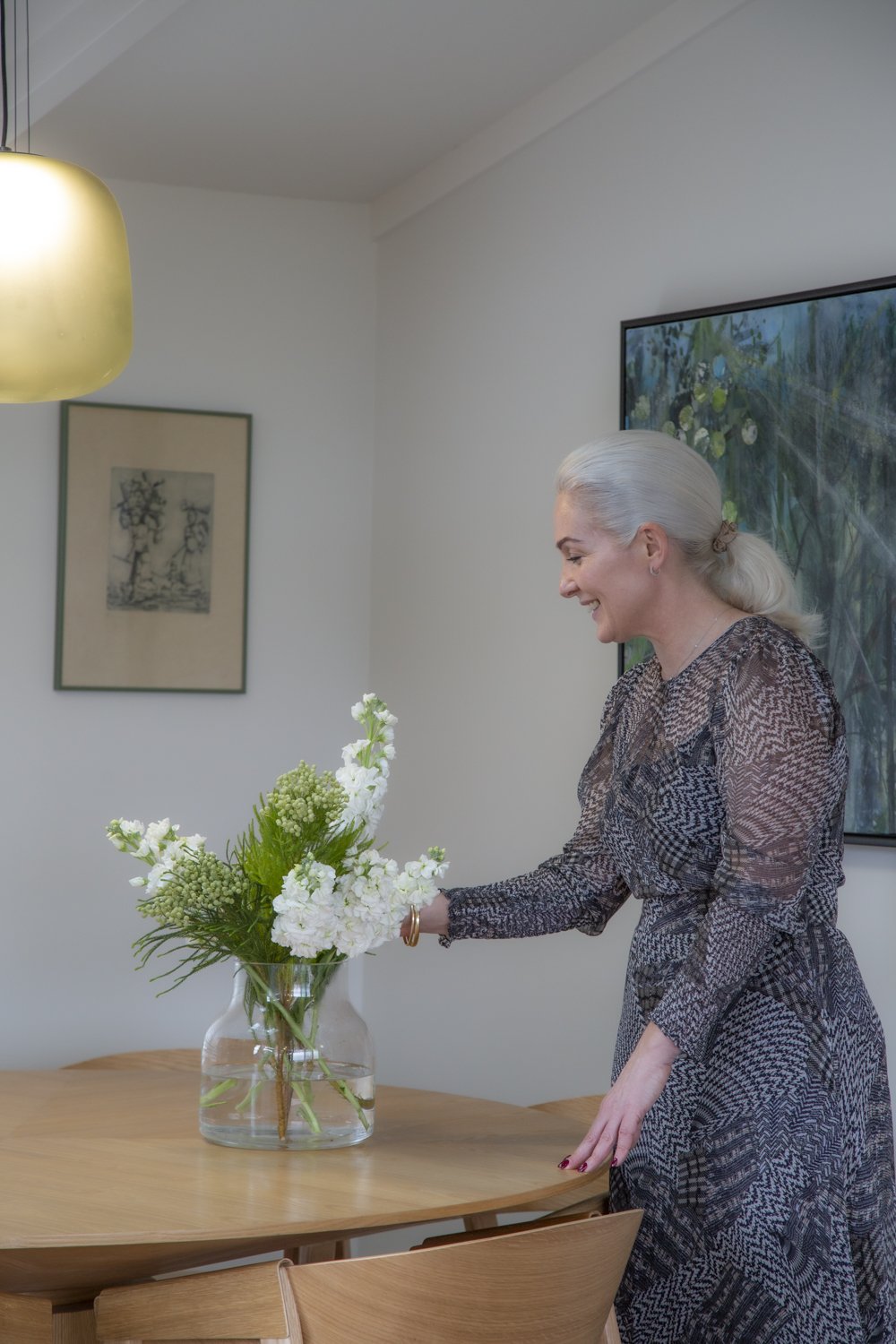
The finished home is a welcomed sanctuary for this couple, the colour and finishes palette providing a relaxing, stylish and much loved space they enjoy every day. A clear vision and design direction has created a cohesive home, one that is true to the original architecture while offering a contemporary space to enjoy modern, everyday living.
COLLABORATORS
To read more of our recent blogs, click here.
